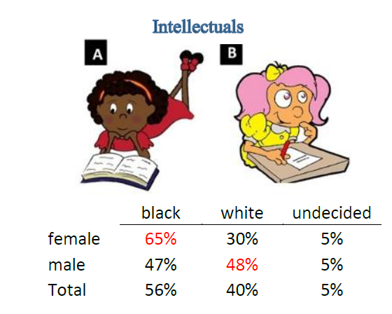
I developed this marketing strategy in association with Socio-Dig. The challenge was that MFK (Meds and Foods for Kids) wanted to select a marketing logo to put on fortified snacks for Haitian children. They had two logos already selected and they wanted to make sure they were the right logos, meaning logos children would like. To determine this, we matched a series of graphic, cartoon-like images with a single conspicuous trait differentiating the two images. For example, the two girls depicted in the image above are both engaged in intellectual activity, one is white and one black. The expectation is that children who preferred one image over another would be doing so based on the color of the girl. We presented the icons to some 200 children at 5 different schools, and we asked the children to choose which icon they preferred. On any one dimension, like color, we compared not simply one, but a series of images. For example, for skin color, we also compared black vs. white-skinned male soccer players, black vs. white-skinned rappers, black vs. white princesses, black vs. white boy-heroes, black vs. white girl-heroes, black vs. white man-heroes etcetera. Thus, when testing for skin color, we sought to control for the influence of other traits, such as preference for athlete vs. intellectual, male vs. female, conservative vs. hip/stylish, robust vs. thin, preference for icons representing a series of ages from toddler to young adult. We compared each of these traits along the multiple other dimensions. For example, we compared the athlete to the musician, the athlete to the princess, the princess to the girl-hero. We tested aggressive images against protective, animals against human icons. It’s a fun report. Enjoy.
Report_MFK_4_29_15


